Logotype
CLIENT: OKQ8
CHALLENGE: OKQ8 wanted a symbol for its sports association — something that could capture movement, energy, and the forward‑leaning spirit of the brand. The challenge was to create a logotype that felt athletic and dynamic while still connecting clearly to OKQ8’s identity and its growing focus on charging and future mobility.
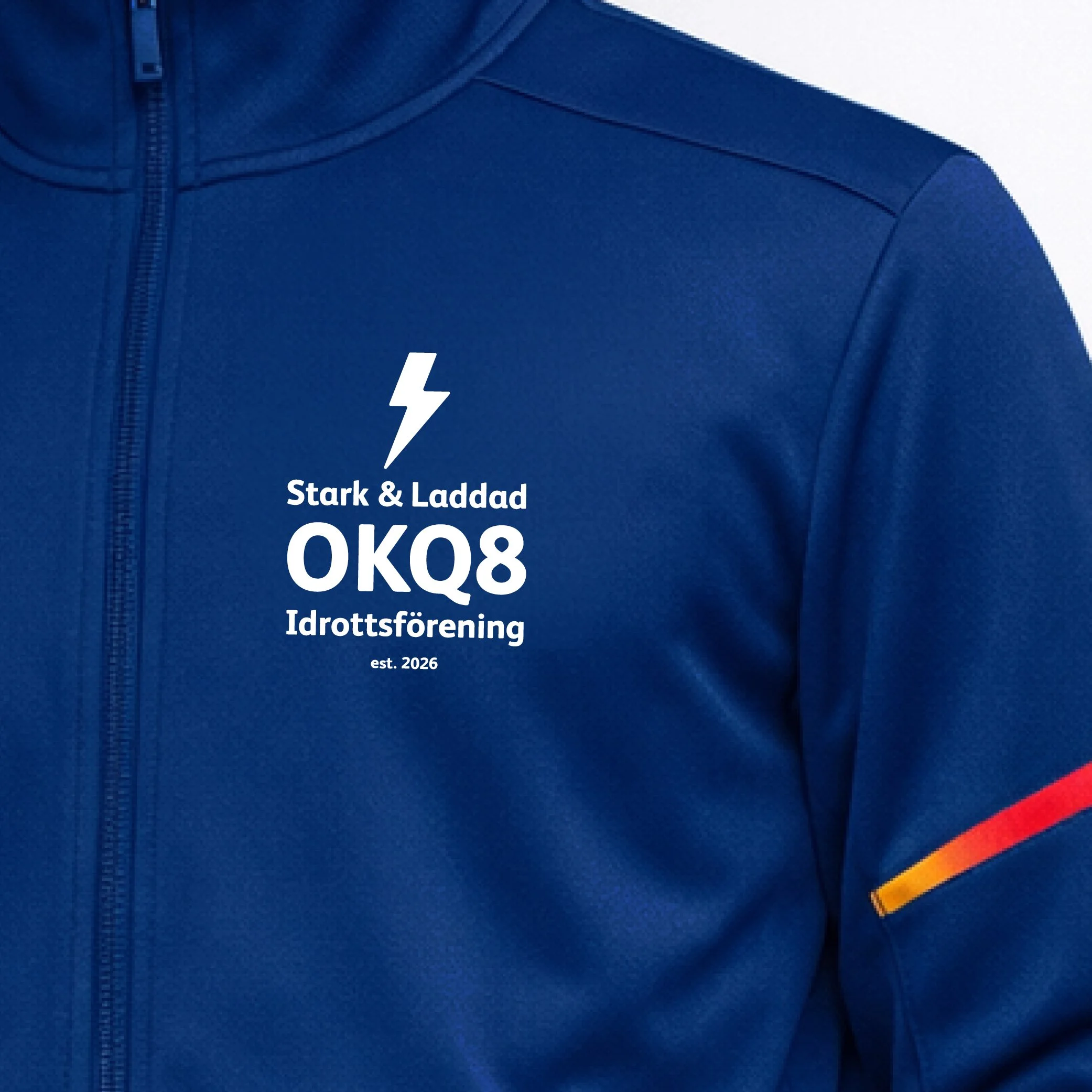
SOLUTION:I created a lightning‑driven logotype that blends athletic energy with OKQ8’s charging identity, all within the brand’s visual guidelines. The mark signals power, speed, and forward motion — a modern symbol built for sports contexts and fully aligned with OKQ8’s design system.
MY CONTRIBUTION: Art direction, logotype design.